How to find frequency statistics is the main topic of this article. The number of times an occurrence is observed or recorded in an experiment is called frequency statistics. There are a variety of ways to depict frequency statistics, which will be discussed in the following sections.
First, we need to fully introduce the frequency statistics and common terms in this field.
What Is Frequency?
In statistics, frequency distribution gives the knowledge about the number of events (frequency) of different values scattered in a given time period, within a list, among a table, or a graph.
Frequency measurement is based on a set of data.
What Is Data?
Data refers to a group of values or digits that are required to be organized to be interpreted. Every piece of information expressed by a value or number is called data. For instance, the grades gained in a Math exam is a set of data. As another example, the number of birds sitting on a tree during a day is data. Data is a collection of information, experimental studies or observations.
Raw Data
Raw data is a primary set of inputs. These inputs are not organized. Therefore, in the first level of data collection, you have raw data. Consider that you gather some information about the favorite colors of a group of six friends. You get the answers as Red, Red, Blue, White, and Blue. This group of information is called raw data.
Discrete Data
Discrete data includes data that is recorded as whole numbers -integers – such as the number of apple trees in an orchard or the number of people living in a six-story building. This information cannot be in the form of fractional numbers or decimals.
Continuous Data
Continuous data can include fractional and decimal numbers. Such as the recorded temperatures of your city air during a month or the average grades of your courses during your studies.
What Is Frequency?
The frequency of a specific value is defined as the number of times the value is present in the data collection. Therefore, in the example of favorite colors of your friends, it can be said the three friends like the color Red. Thus the frequency of the color Red is three.
So, to answer the question of how to find the frequency statistics of each data, the first step is to organize all the values.
How to find the frequency statistics of a value from a very large dataset sometimes is not simple or possible. So to make the data easier to be sensible a frequency table or graph can be made. Here, look at this example of ten students’ height in centimeters.
The recorded heights include the values of 145, 150, 145, 150, 138, 152, 139, 144, 138, and 136.
The frequency table can be plotted for each height to be repeated as a data value several times. Therefore, each of the heights that can be seen among the above numbers can be written as rows of the table and in front of each of them, the number of repetitions can be written.
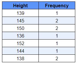
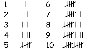
Of course, if the data set is large, for example when we are dealing with 100 students’ data, we utilize tally marks to count. It makes our work more systematic and simple. In the figure below there is an example of how to use tally marks.
Frequency Distribution
With this explanation, the frequency distribution can be defined as follows: the frequency distribution of a series of distinct values in some variables refers to the number of times they are seen. Meaning that it indicates how the values are distributed over a range of data. Often we apply frequency distribution to review categorized variables.
It has an eminent standing in statistics. Furthermore, a well-made frequency distribution leads to the possibility of a comprehensive analysis of the arrangement of the group concerning addressed properties. Accordingly, the combinations into which the population decomposed are found. Frequency distribution applies to both qualitative and quantitative parameters.
Frequency distribution gives us a brief explanation of data grouping classified into mutually particular classes and the number of repetitions in each class. It is a method of displaying disorganized data such as presenting the outcomes of an election, people income in a country for every job, sales of a dress during a season, student marks, etc.
Depiction
In addition to finding the frequency statistics, displaying the frequency distribution is also important. Here, the ways to demonstrate the frequency of each value or parameter are introduced.
Histogram
A histogram is a proximate show of data. In order to create a histogram, the first step would be to specify the range of values. In other words, we must break the whole range of values into several intervals. Then we calculate how many values are among each interval. So the bins can be drawn for the counted numbers for every interval.
The bins are ordinarily designated as continuous and non-overlapping intervals for a variable. The bins are neighbor to each other. Moreover, they are usually of equal sizes, although it is not a required condition for all cases.
In the following image, you can see an example of histograms.
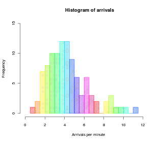
When the intervals are of equal size, a rectangle is upraised over the interval with height proportionate to the number of samples belonging to each bin which is the frequency. However, a histogram may also be drawn as normalized bins to represent relative frequencies. In this case, it displays the proportion of the items falling into the relative range. The sum of all the heights is equal to 1.
To know more about histograms, you can check this link.
Line Charts
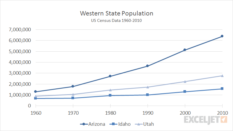
A line chart (also called a line graph) is a sort of chart giving some information as a set of points called markers which are connected together by several straight line sections. It is a fundamental version of charts popular in different areas.
These charts are comparable to the scatter plots with the difference that the measuring objects usually with respect to the x-axis values are arranged and connected using straight lines. Most of the time, a line chart is used to depict the trends of data across the time intervals. Hence, the lines are often drawn in terms of time. In such instances, they are identified as run charts.
An example of line graphs is demonstrated in the following figure.
Bar Charts
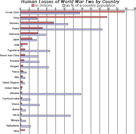
A bar chart (bar graph) is a way of showing frequency distribution that represents the data using rectangular bars with heights or lengths corresponding to their values. The bars are drawn horizontally or vertically. Another name for the vertical bar charts is the column charts.
A bar chart exhibits comparisons among distinct classes. The application of one of the axes of the chart is to display the particular kinds which are compared. The other axis shows the values of each class.
Sometimes we come across grouped bar charts where each category can allocate more than one bar. In this case, in addition to the general comparison between the categories, the analogy is performed within each category. In the image below, you can see an example of these diagrams.
Pie Charts
A pie chart (also named circle chart) is a statistical graph in the form of a circle, divided into some sectors to show numerical proportions for each class. In this type of chart, the length of each slice arc, or therefore the angle and the covered area, is equivalent to the represented amount. Although its name is due to the similarity to a pie that is cut, there are differences in the performed method. To get acquainted with pie charts, look at the figure below.
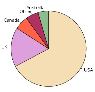
Pie charts are of the most extensively used presenting ways in the business. But some critics have warned against using them to make comparisons with these charts, especially between multiple charts. Therefore, in most cases, it can be replaced with other types of charts, such as bar charts.
If you want to know about how to draw charts and graphs with the help of one of the most useful tools for this purpose, namely Excel software, you can watch this video.
Types of Frequency Distribution
In general, there are five types of frequency distributions, which we will briefly introduce in this section.
Grouped Frequency Distribution
Grouped data are those set by gathering separate measurements of a variable into groups, in a way that the frequency distribution of these collections works as a helpful tool to summarize and analyze the data.
In this way of organizing the data, we deal with assortment the measurements into intervals and arranging the frequencies for separate intervals. The outcomes are reported in a grouped frequency table. In grouped frequency distribution type the names of the intervals are classes.
For example, if we want to classify the marks of the students of a class in math into five-point intervals, we have done a grouped frequency distribution.
Ungrouped Frequency Distribution
Ungrouped data is referred to as the data presented as individual data inputs regardless of the group for each of these points. For example, if we want to arrange the weight of each student in a classroom in the frequency distribution table, this is an ungrouped frequency distribution.
Cumulative Frequency Distribution
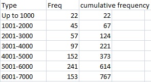
Cumulative frequency refers to the frequency distribution that considers the absolute number of all events that occurred before and at a particular point, which is the sum of the frequency of a class and all the classes below that.
This type of frequency distribution is very important when we require identifying the frequency of all values up to a particular point.
The following table shows how to calculate cumulative frequencies according to values of frequency.
Relative Frequency Distribution
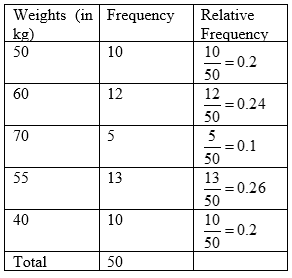
The relative frequency (also called the empirical probability) of an occurrence is the normalized absolute frequency to the all events number. Relative frequency distribution displays the proportion of the total number of measurements relative to any value or a class. It is linked to the distribution of probability with wide use in statistics.
The following figure shows the method of calculating the relative frequency.
Mathematical Approach to Find Relative Frequency
If we want to answer the question of how to find frequency statistics in mathematics, we can define the relative frequency with the help of mathematical relations as follows.
f_{i}=\frac{n_{i}}{N}
In the above relation, ni is the group or value that we want to calculate its frequency and is the total numbers of parameters that are mathematically defined as:
N=\sum n_{j}
The index j represents a particular value or a class of values.
Cumulative Relative Frequency Distribution
A cumulative relative frequency distribution is a gist of a collection of data in the form of a table to show the relative frequency of values below or equivalent to a threshold limit of a class. Previously, relative frequency has been introduced.
In the table below, the way of computing the cumulative relative frequency is shown based on the values of cumulative relative frequencies.

How to Find Frequency Statistics?
Usually, experts use some types of statistical programs to make their corresponding graphs. But it is still popular among mathematicians to do every calculation and build the histograms by hand. In this section, we will look at the question of how to find frequency statistics and answering it by completing the step-by-step process to make a frequency distribution and its relevant graphs.
To draw the histogram, first we have to find the frequency distribution. The basic idea of finding the frequency distribution is to organize the data into different groups (classes or bins) to see the patterns better.
Usually, there are two types of questions; first, asking about your age and second, if you are in the range of 20 and 25. In the latter, the ages are classified into groups.
The second method is suitable for situations where the number of data is large and the classification of people in different groups is more useful than having a large number of inputs (for example, including the age of people in a large statistical community as single data).
How to Find Frequency Statistics in Grouped Distribution
The following steps should be taken to understand how to find frequency statistics in the case of a grouped frequency distribution.
Step 1: Finding the Range of Data Changes
The range of data is the difference between the highest and the lowest values. We require this information to find out how to divide all the inputs into groups.
Consider that we want to group the weight of the students in a class. For example, if the minimum weight is 48 kg and the maximum is 78 kg, then:
Range=78-48=30
Step 2: Finding the Range Changes within Each Group
Depending on how many groups we need to categorize, we divide the range obtained in the first step by the number of these groups. Then, we can round up the calculated value to the nearest integer. This is because we can work with these values easier than working with decimals. The obtained value is called the class width. Doing this enables the statistician to understand the size of each group.
But here a question arises and that is how many groups should we have?
Consider the number of groups to be very small. In this case, the range of data changes within each group is very large. For example, in the example above, if we want to classify the total weights into only two categories, each category will be in the range of 15 kg (30/2 = 15). So the information we get from this type of classification is small and probably useless.
Conversely, suppose the number of categories is too large. For example, in this example, we want to have 15 categories. So in each group, we will have only a range of two kilograms (30/15 = 2). So this case is not much different from the ungrouped frequency distribution mode.
So, it is important that the number of categories is not too much or too little. For example, in this example, it is better to have 5 or 6 categories.
Usually, people get help from computers to choose the optimal ranges. However, when the user works with their own dataset, they must check the shape of graphs before being certain about choosing good numbers.
Step 3: Creating the Groups
The third step in answering how to find frequency statistics is to determine the groups.
We should start with the lowest value. In this example, as said before, it is 48. Also, we divided all the data range into 5 groups. So the width of each group is 6. Then we count by 6 until we reach to last group ending at the highest number, which is 78 in this example.
So, the first group is 48 to 54 since 48+6=54. The next group will be 54-60 and so on. We put all these classes on a table with the label of “classes”. The next column will be the “frequency” values which are described in the next step.
Step 4: Finding the Frequencies
This stage is presumably the most tiresome and the principal cause of being unreasonable to create the frequency distribution histogram manually in case of large data collection. In this part, we must count the number of points in each group.
For the above example, we should find all data existing in the first class between 48 and 54 not including 54. Generally, the upper endpoint number of each group isn’t regarded as a member of that group. It belongs to the next class. So, if there is a weight equal to 54, it would be in the second group.
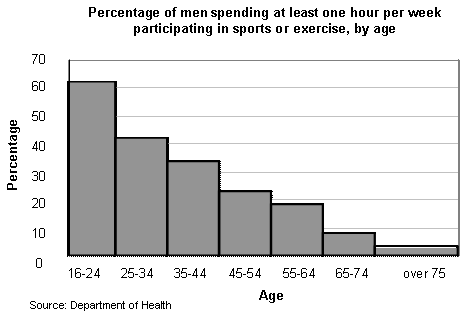
To build a histogram from the results, the groups (classes) are put on the horizontal axis which sizes are equal to class width, and the frequencies are on the vertical axis. Ultimately, the bars are applied to show the frequency of every single group with the heights proportional to the size of each group.
For example, the following figure shows an example of the use of histograms to display statistical information in sociological applications for grouped distribution classification.
How to Find Frequency Statistics in Ungrouped Distribution
The way of responding to the question of how to find frequency statistics in ungrouped distribution is very similar to the grouped frequency distribution, except that the second and third steps would be eliminated since there are no groups in this type of distribution.
So in this case, our task will be easier. This means that we sort the data in order from small to large. For example, if we still want to deal with the above example, we write the weights from 48 to 78 in ascending order from low to high, inside the frequency distribution table in the first column.
Then in front of them, in the second column, we put the number of times that each of the weights is repeated as the frequency.
Although this method seems simpler, it is only used for cases where there is not much data. And if the number of data increases, the grouped distribution method is preferred.
Read More on Linquip
- All You Need to Know about Final Value Theorem
- Your Convenient Preventive Maintenance Checklist
- Difference Between Scalar and Vector Quantity
- Difference Between Period and Frequency
- Difference Between Cell and Battery: Ultimate Guide
- What is Speed Control of Induction Motor?
- What’s the Difference Between Speed and Velocity?
- 10 Main Types of Energy Storage Methods
- How Does a Nuclear Reactor Work? A Closer Look at the Working Principle of Nuclear Reactors


